
Instagram Changed Its Wordmark After 10 Years. The Internet Called It "Instagzam"
Instagram quietly refreshed its decade-old wordmark — and the internet immediately renamed it “Instagzam.” A masterclass in what happens when a brand touches its most recognisable asset.

2026
The write-up
Instagram has refreshed its wordmark for the first time in a decade, giving its identity a sharper, more contemporary look while retaining the visual cues that make the platform instantly recognisable.
The update may appear subtle, but one tiny detail has already caught the internet's attention: the letter "r".
The "r" Started the Conversation
The refreshed wordmark blends print-inspired lettering with a cursive influence, creating a more fluid and distinctive type treatment.
But instead of quietly passing unnoticed, the change triggered a wave of online reactions, with users jokingly reading the new logo as "Instagzam".
It is a reminder that even the smallest change to a familiar brand asset can disrupt years of visual muscle memory. When an identity has been seen billions of times, every curve, letter and spacing choice becomes recognisable.
It's Bigger Than The Wordmark
The wordmark refresh is part of a broader evolution of Instagram's visual identity.
The platform is also expanding its typography system with Instagram Sans, Instagram Pen and Instagram Mono. Together, these typefaces give Instagram a more flexible visual language that can adapt across its growing ecosystem of content, creators and communication formats.
The goal is not simply to make Instagram look different, but to give the brand more tools to express itself consistently across different contexts.
They Didn't Touch The Icon
Perhaps the most strategic part of the refresh is what Instagram chose not to change.
The iconic camera icon remains untouched, unlike the platform's much more radical visual transformation in 2016.
That restraint matters. The icon carries enormous brand equity, so changing the wordmark while retaining the familiar symbol allows Instagram to modernise without sacrificing recognition.
“A good rebrand does not erase recognition. It evolves it. Instagram is keeping its strongest visual asset intact while refining the elements around it — the result is a more contemporary identity that acknowledges how much the platform has evolved since its last major wordmark update. And the “Instagzam” reaction is proof of something marketers often underestimate: when a brand becomes deeply embedded in culture, even a tiny design change can become a conversation.”
The evidence
01 / 03 · Campaign still
- Brand
- Industry
- Technology / Social Media
Related case files
Related case files
 Decoded
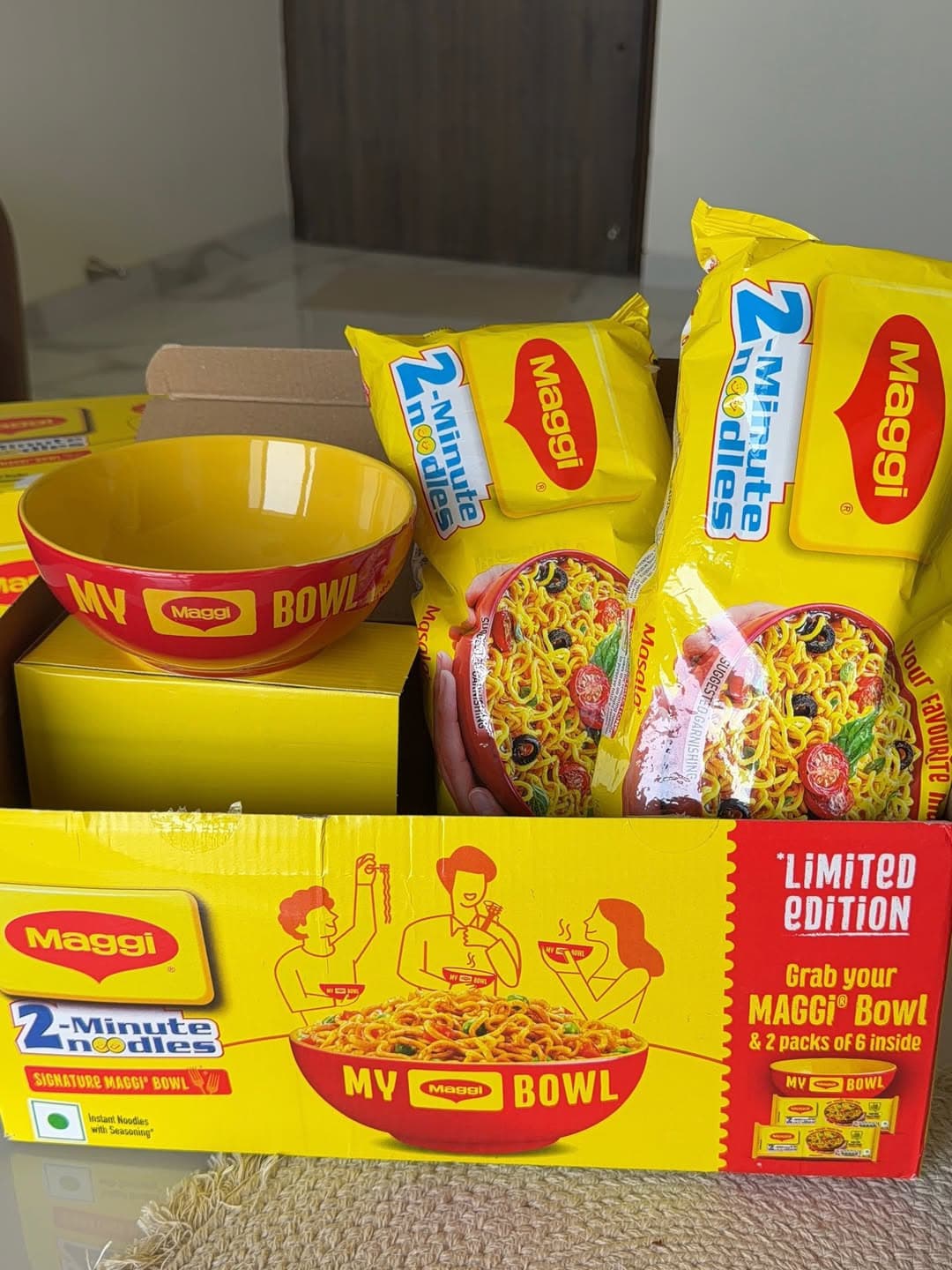
MAGGI at 50
A 50-year milestone told through commemorative India Post stamps and shared memory — not corporate self-congratulation.
 Decoded
Jashn-e-Riwaaz
A festive campaign withdrawn after backlash — a case study in the gap between brand intent and audience perception.
 Decoded
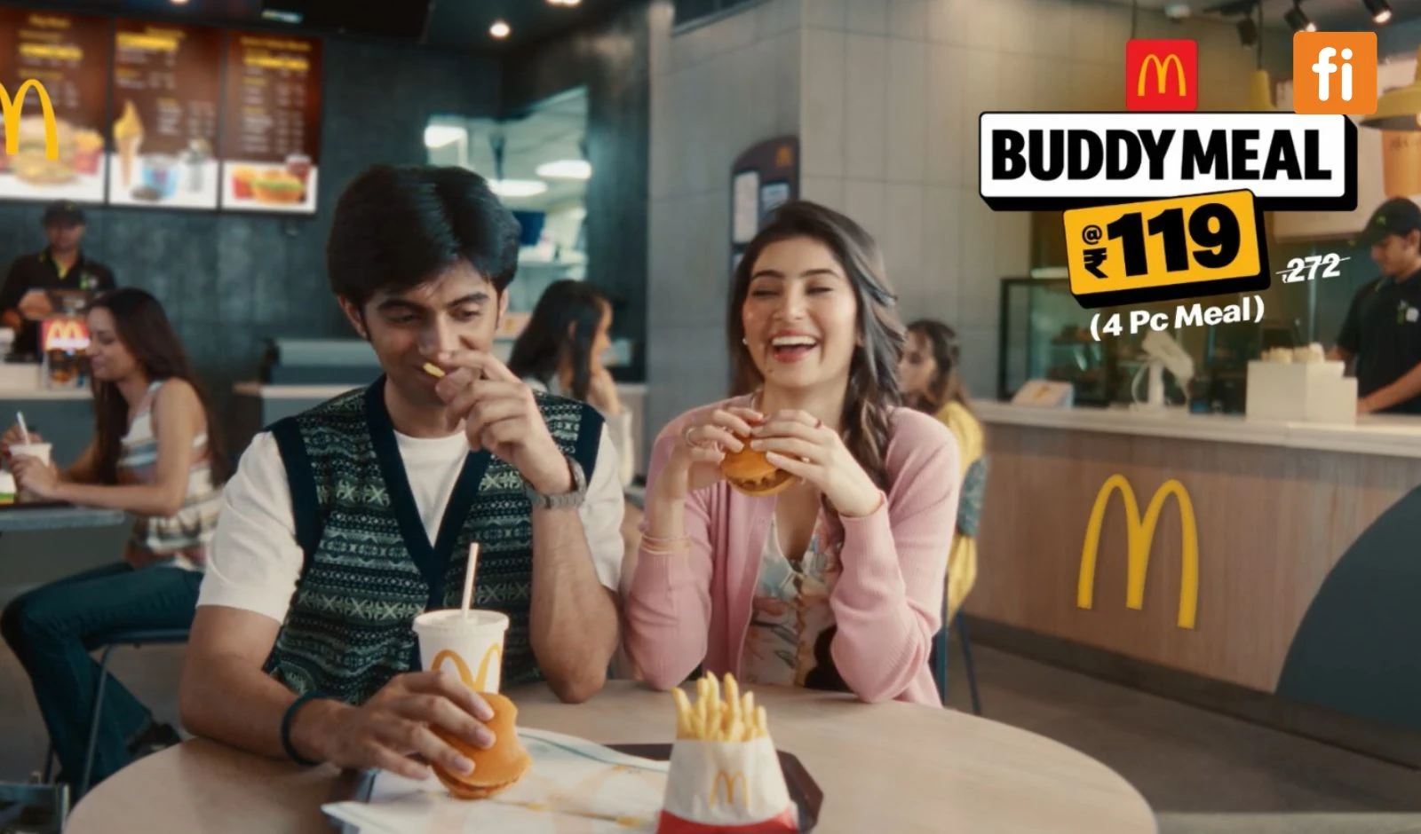
Buddy Meal
Nostalgia resurrection — McDonald's brought back 'Burger Bacchi' Sara Arjun to launch the ₹119 Buddy Meal.